
If you’ve ever wiped down a countertop and watched new crumbs appear five minutes later, you already know the truth: the “prettiest” counters aren’t always the most livable. Some colors and patterns look stunning in a showroom—then show every fingerprint, water spot, and coffee drip in real life. The sweet spot is choosing a surface that hides daily messes (without looking busy or outdated) and still reads as premium the moment someone walks in.
Here’s how to pick countertop colors and patterns that are forgiving, photo-ready, and timeless—especially if you want a kitchen that looks clean even when life is happening.
Why some countertops show everything
Counters “reveal” messes for a few reasons:
- High contrast: Dark, solid colors show light crumbs; bright whites show dark spills.
- Uniform patterns: A flat, consistent surface gives your eye nothing else to look at—so every smudge becomes the focal point.
- Glossy finishes: Polished surfaces reflect light and can highlight streaks and water spots.
That doesn’t mean you need to avoid white or dark countertops entirely—you just need to choose the right version of them.
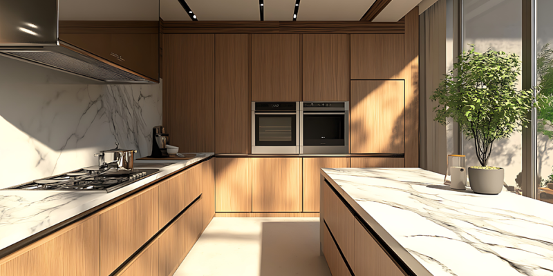
1) Warm whites with soft, scattered movement
A true, stark white countertop can look crisp, but it tends to show spills (especially coffee or red sauce) and can feel sterile in some homes. A better option for hiding messes is a warm white with gentle movement—think subtle marbling, light mottling, or cloudy veining.
Why it works:
- The surface still feels bright and premium.
- Light pattern variation disguises smudges and faint stains.
- Warm undertones make the kitchen feel welcoming rather than clinical.
Look for patterns that feel natural and “low-contrast.” If the veining is too dramatic, it can dominate the room and lock you into a very specific style.
2) Light greige or taupe with fine texture
One of the most forgiving countertop families is the light “in-between” range: greige, taupe, and mushroom tones. These shades hide crumbs better than pure white, conceal smears better than dark surfaces, and pair well with both warm and cool cabinetry.
Why it works:
- The tone masks everyday dust and crumbs.
- A fine grain pattern keeps the surface from looking flat.
- It complements most backsplashes without clashing.
This is an especially strong choice for households that cook a lot and don’t want to feel like they’re constantly cleaning for the kitchen to look presentable.
3) Mid-tone patterns that balance contrast
If you want a little more personality without the “busy granite” look of decades past, aim for mid-tone patterns—where the background and pattern colors are relatively close in value.
Great examples:
- Soft charcoal-on-gray speckling
- Beige base with muted brown and cream movement
- Blue-gray base with gentle, blended veining
The goal is controlled variation. You want enough movement to camouflage messes, but not so much that the countertop becomes visual noise.
4) “Salt-and-pepper” looks with a modern twist
The classic salt-and-pepper concept—tiny flecks of light and dark—has a reason it’s survived for so long: it’s extremely forgiving. Modern versions look cleaner and more refined than older, chunkier patterns.
Why it works:
- Hides crumbs, smudges, and small spills effortlessly.
- Looks cohesive with stainless steel, black hardware, or mixed metals.
- Feels premium when paired with the right edge profile and backsplash.
This is a smart pick for kitchens that see heavy daily use, especially on islands where people snack, do homework, and set down bags.
5) Marble-look patterns: choose subtle, not theatrical
Marble-look counters can be beautiful and upscale—but the wrong pattern can show messes (and date quickly). If you want a premium look that’s also forgiving, choose marble-inspired surfaces with soft, dispersed movement rather than high-contrast “lightning bolt” veining.
What to look for:
- Veining that fades in and out rather than sharply cutting across the slab
- A background that isn’t pure white (slightly warm or soft gray)
- Vein colors that coordinate with cabinetry and flooring tones
Done right, it’s elegant and livable. Done wrong, it’s dramatic but demanding.
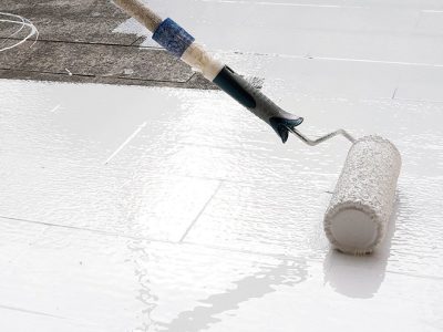
6) Honed or matte finishes to reduce streaks
Finish matters just as much as color. A honed or matte finish can reduce glare and make fingerprints and streaks less noticeable—especially on darker colors.
A quick caution:
- Some matte finishes can show oil marks depending on material.
- Natural stones have different maintenance needs than engineered surfaces.
Still, if you hate seeing streaks after cleaning, a softer finish can be a game-changer for day-to-day satisfaction.
7) The “premium” factor isn’t just the pattern
Homeowners often think premium = expensive stone, but buyers and guests read “high-end” through a combination of cues:
- Clean seam placement (especially on islands)
- A polished edge profile that matches the kitchen style
- A backsplash that’s coordinated, not competing
- Good lighting that flatters the surface
That’s why planning countertop design for kitchens should consider the whole visual system: cabinets, floors, lighting, hardware, and how the countertop looks from the main entry point into the room.
8) Quick picks by lifestyle
If you want a fast shortcut, match your countertop choice to how your kitchen actually operates:
- Busy family kitchen: light greige/taupe with fine texture; modern salt-and-pepper
- Frequent entertaining: warm white with soft movement; subtle marble-look
- Low-maintenance priority: mid-tone blended patterns; matte finish options
- Love the dark look: choose charcoal with movement (not solid black) and consider a softer finish
The most livable “premium” countertops share two traits: they avoid extreme contrast, and they include enough natural-looking movement to camouflage real life. If your countertop looks great while you’re actively cooking—and not just after you’ve cleaned—it’s the right choice.


Comments